Here’s the chart that might change your mind about refugees and our national refugee policy. Despite all the huffing and puffing from our pollies there is no emergency, no crisis in which we are being overrun by refugees. The simple fact is that we have long welcomed refugees at levels similar to those at
present, and have indeed often welcomed more into our communities.

What’s changed is the way refuges are arriving. Most come from refugee camps around the world, where they have been assessed by the UNHCR and applied for resettlement, but since the late eighties an increasing number have been arriving to our shoes by boat or plane, after which their claims are assessed “onshore”. Those found to be refugees are then given asylum in Australia.
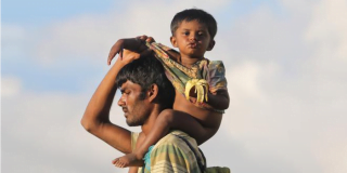
So why the angst? It’s not because some of the boats sink. We were up-in-arms over “boat people” well before the tragedy on Christmas island a year or two back. We’ve been accepting large numbers of refugees for decades and the world hasn’t fallen apart. Indeed we’ve built an astonishingly successful yet culturally diverse society. Refugees have enriched our society.
It seems our angst is driven by little more than fear. And an irrational fear at that, when we consider that since the late seventies refugees have not threatened our well-being in any way but have improved it. If only we could get over our angst we’d discover the rare but happy coincidence between doing what is right by people fleeing persecution and our national self-interest. With only 80,000 of the 800,000 refugees in the world needing resettlement each year finding it we have a wonderful opportunity.